Why does Africa look so small on maps?
Short answer: Africa looks small because most world maps use the Mercator projection, drawn in 1569 for sailors. It keeps compass courses straight, but it stretches land more the farther it lies from the equator. Africa sits across the equator and grows far less, while Greenland, Europe and North America swell. In reality Africa is about 14 times bigger than Greenland.
A map drawn for sailors
In 1569 the Flemish mapmaker Gerardus Mercator published a world map on eighteen sheets. Put together, it measured about 202 by 124 centimeters. Its Latin title ends with ad Usum Navigantium, "for the use of sailors." Every choice on the map serves a navigator with a compass.
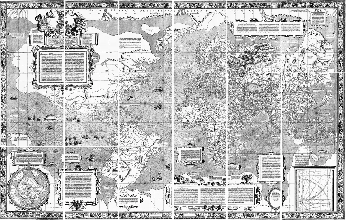
A navigator in the 16th century steered by compass. The simplest course to hold was a constant bearing, say 60 degrees east of north, all the way across an ocean. Mapmakers call that course a rhumb line. On a globe it curves. Mercator drew every rhumb line as a straight line on paper. A sailor could lay a ruler between two ports and hold that angle all the way. By the 18th century his projection had become the standard chart for navigation.
The price of a straight course
On a globe, the lines of longitude meet at the poles. On Mercator's map they run straight up and down, side by side, so everything away from the equator gets stretched sideways. To keep shapes and angles correct, Mercator stretched the map by the same amount from top to bottom.
The stretch grows with the secant of the latitude. That trigonometric value is 1 at the equator and climbs faster the closer you get to a pole. At 60 degrees north it is 2. Distances there look twice as long, and areas four times as large. Near the poles the factor heads toward infinity, which is why Mercator maps cut off the far north and south. Beyond about 70 degrees north or south, the map becomes practically unusable.
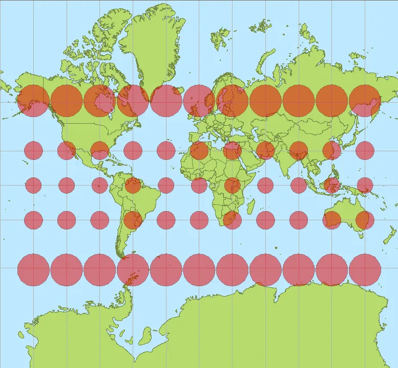
Africa straddles the equator. Most of it sits where the stretch is small. Greenland, Canada, Russia and Europe sit where it is big.
What the numbers say
Africa covers about 30.37 million square kilometers. Greenland covers about 2.17 million. Africa is roughly 14 times larger, yet on a Mercator map the two look about the same size. Greenland's real area is closer to the Democratic Republic of the Congo alone.
Other pairs mislead in the same way. On the same map, Africa looks about as big as South America, though it is more than one and a half times larger. Alaska looks as large as Australia, which is 4.5 times bigger in reality. Reuters adds that Africa is about three times the size of Canada and more than one and a half times the size of Russia.
Why the old map stuck around
Atlases mostly dropped Mercator for world maps in the 1940s. Schools kept it: Reuters describes the Mercator map as the long-time standard for both navigation and education. Then web mapping brought it back in a version called Web Mercator. Google Maps switched its desktop view to a 3D globe in 2018, Reuters reports. The mobile app still shows Mercator by default.
Mercator himself used the equal-area sinusoidal projection when he wanted to show relative sizes.
The campaign to correct the map
In 2025 the African Union, which represents 55 African countries, endorsed a campaign called Correct The Map. Two advocacy groups lead it: Africa No Filter and Speak Up Africa. They want schools, governments, the World Bank and the United Nations to switch to Equal Earth. That projection, published in 2018, aims to show every country at its true size.
"The current size of the map of Africa is wrong," Moky Makura, executive director of Africa No Filter, told Reuters. Selma Malika Haddadi, deputy chairperson of the AU Commission, put it this way: "It might seem to be just a map, but in reality, it is not." A World Bank spokesperson said the bank already uses Winkel-Tripel or Equal Earth for static maps. The bank is phasing Mercator out of its web maps.
In September 2026 the campaign reached the UN General Assembly. A resolution led by Togo, promoting the Equal Earth projection, passed by 164 votes to 1, with 6 abstentions. The United States cast the only vote against. The resolution is not legally binding. The Togolese ministry said it "in no way challenges the use of the Mercator projection for maritime and aerial navigation, for which it remains fully suited." Togo's foreign minister, Robert Dussey, told Reuters the country hopes to change its school geography materials by the end of the year.
You can test it yourself on The True Size Of, an interactive map. Drag Greenland down to the equator and watch it shrink to its real size next to Africa.
FAQ
How much bigger is Africa than Greenland?
About 14 times. Africa covers roughly 30.37 million square kilometers and Greenland about 2.17 million. On a Mercator map they look about the same size.
Did the UN ban the Mercator map?
No. The resolution the UN General Assembly passed in September 2026 is not legally binding. It promotes the Equal Earth projection, and Togo, which led it, said Mercator stays fully suited to sea and air navigation.
Which map shows countries at their true size?
An equal-area projection. The Correct The Map campaign backs Equal Earth, published in 2018, and the World Bank already uses Equal Earth or Winkel-Tripel for its static maps. Mercator himself used the equal-area sinusoidal projection when he wanted to compare sizes.
Why do we still use the Mercator map?
Mercator keeps every compass bearing a straight line, which made it the standard chart for navigation from the 18th century. Web maps use a version of it today, and Reuters reported in 2025 that the Google Maps mobile app still shows it by default.
Sources
- Wikipedia: Mercator projection
- Wikipedia: Africa
- Wikipedia: List of countries and dependencies by area
- Wikipedia: European Union
- The True Size Of (interactive map)
- Citizen Digital / Reuters: The true size of Africa (September 4, 2025)
- Citizen Digital / Reuters: UN approves resolution in support of map that shows Africa's true size (September 4, 2026)